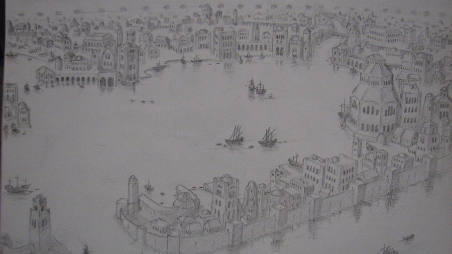
I'm both happy and very sad about the reboot of Pelargir. Happy beacause I always thought the city was too large compared to Osgiliath and the new one seems a bit smaller. But more sad because I love so much the design that was used for the first one, with half circle walls, the triangle thing and the central tower. In my opinion, the new one is by far less interesting. If I understand, it have been changed because Tolkien compared somewhere the city to Venise, but I really don't see what prevent us to make the first design look like the italian city. The outer "round part" ould be left like that (a bit smaller though), but the central triangles could be maked like Venise.
I think that could be a very good mix of the best of both designs .
.
A link to Project Pelargir (never finished), a greatly impressive modelling project using that design :
http://wiki.lindefirion.net/ProjectPelargir
A map of the old design, the colored parts are the ones that should be "venisified" :

I think that could be a very good mix of the best of both designs
A link to Project Pelargir (never finished), a greatly impressive modelling project using that design :
http://wiki.lindefirion.net/ProjectPelargir
A map of the old design, the colored parts are the ones that should be "venisified" :

Last edited:

