• Welcome to MCME!

    Minecraft Middle Earth is a Minecraft community that recreates the world described by JRR Tolkien and his writings. Everyone can participate in organized events in which we collaborate to create major landmarks, terrain, caves, castles, towns, farms and more.

    To get started, visit The New Player Guide

    Joining the server

    Joining the server can be done straight away, but you will have to pass the New Player Quiz. Use the The New Player Guide to get acquainted with our community.

    IP: build.mcmiddleearth.com

Easter Render Competition

Stoog_Gaming

Guide
Guide
Supporter
-Easter Render Competition-
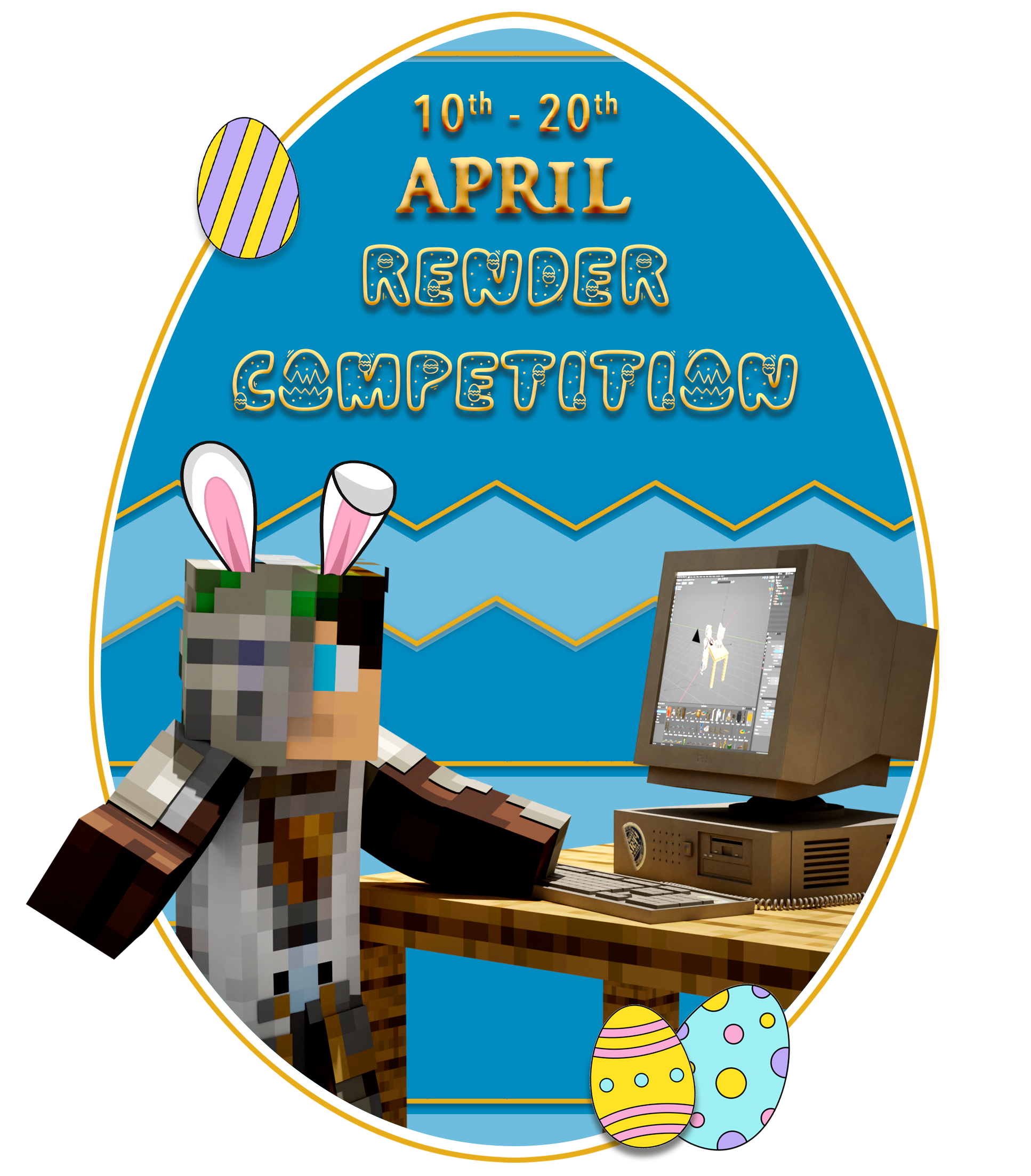
4-rendercomp2.png


Welcome to yet another MCME art competition, this time we are trying something different.
A render competition.
Yes, you read that right we are looking for the best 3D renders following our themes of Middle Earth or Easter.

How to participate and rules
To participate all you need to do is make a render using a 3D program of your choice. Blockbench, Blender, Maya, etc
Once you have finished your render/s you can upload it here in this thread.
Rules
  • You cannot use old renders
  • Maximum of 2 render submissions
  • can include a background or be transparent

The competition will continue until the 20th at which point myself @Stoog_Gaming and @maski98 will be judging the entries and announcing the winner in Discord the day after.

Blender Users
If you plan to use Blender, you can watch this workshop I recorded yesterday about my approach to making renders.

 
---- Competition Closed ----

Winner: @aylalya

Ayla's render has a fun playful atmosphere using both Blender and Photoshop to blend the render in with the background seamlessly thanks to its almost perfect shadow alignment and some dedicated work to mask all of the carrot leaves in Photoshop.

Notes for the runners-up.

Bohemian Beetle:
Your renders are very good and the first was second behind Ayla's in our judging however, what lost you the top spot was the simplicity of yours compared to Ayla's and the less accurate lighting direction with the shadows of the second render facing in a different direction to the shadows in the original screenshot.

Mapthor:
Your render gives a lovely nostalgic feel I'm sure to those that remember the people lined up in that render however we did not feel that you embodied the themes well enough for the top spot.
If we were awarding an honourable mention this would be it.

Easy Silas:
Your render was a hot contender in the beginning I really liked the simplicity of the render which still managed to get the theme of the render across rather well.
However, I did notice one thing that removed it from the running for us and that is the shadow cast by (I assume yourself I haven't seen your skin) is also overlapping the pot on the stand.

You all made some incredible renders and I hope you make more in the future.​
 
Back
Top